
This map shows travel times from Cambridge, Edinburgh and London. It sounds like a good idea; however, the map is extremely confusing. First of all, the map claims to show both driving and rail travel times, but it is difficult to tell where the map is referring to driving times as opposed to rail times. Furthermore, the map's readability suffers greatly from the absence of a useful legend. The map has a color gradient, which has a corresponding legend. However, the legend has no units of measurement, so the numbers are meaningless. The map also has contour lines, which don't have any explanation on the map. The map is made more confusing by an extensive road network, which seems unnecessary. The information this map is trying to convey is so cryptic that the map might as well be abstract art.

This map, created by Eugene Turner, takes a very unique approach to the display of socioeconomic data. The map shows demographic information for various neighborhoods in Los Angeles. The map shows four variables using stylized human faces. Each variable is represented by a different facial characteristic. This map communicates its information very well. The reader can tell what the faces represent without even looking at the legend. However, the map also has some negative aspects. The map could easily be viewed as racist because the "proportion of white population" variable seems to have a value associated with it. In other words, it looks like the creator of the map was implying that greater "proportion of white population" is better. Nevertheless, the map is successful in design terms because it shows a large amount of information while keeping the map simple and very easy to read.
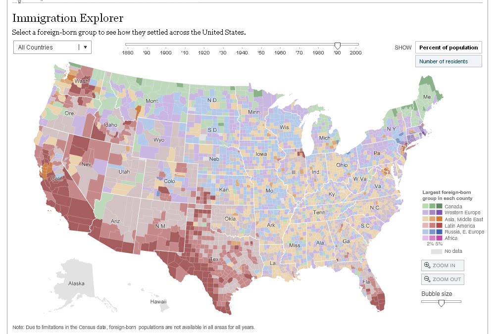
This interactive map is published on the New York Times website. It allows the user to see the percentage of foreign born residents in every county of the U.S. The foreign born residents are broken down by country and region of origin, each represented by a different color. Furthermore, there is a slider bar that allows the user to see historical data from previous decades all the way back to 1880. This map is interesting because it show the nature and scope of immigration, not only over space, but also over time. The dynamic nature of this map allows it to show several trends that have taken place in U.S. immigration. Although the map contains a large amount of information, it remains very readable because only a portion of the information is displayed at any one time.
http://www.nytimes.com/interactive/2009/03/10/us/20090310-immigration-explorer.html?hp


